Mathematical Transformations
This was our Math project for Exhibition 2014. In this project, we had to investigate a mathematical transformation of a linear and non-linear relationship. We made these based on the waste product we used in our other classes. An example would be that my partner and I used plastic utensils As an end product, we made an infographic on one of the relationships (to show at Exhibition). My partner and I decided to investigate the amount of trash put into the Miramar Landfill per year for our non-linear relationship. For our linear one, we wanted to see how many plastic utensils were sold in an area based on that area's economics. We decided (after many failed attempts) that it would be too difficult to use a small area, and used the five most populated states in the United States. Here is some of our data that is not shown elsewhere on the page.
Most Populated States + Economic Ranking (1 = Best, 50 = Worst):
California - 47
Texas - 12
New York - 49
Florida - 9
Illinois - 48
California - 47
Texas - 12
New York - 49
Florida - 9
Illinois - 48
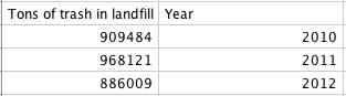
To get this data, we had to call and e-mail many companies. That was probably the most challenging part of the project, actually. We had the most trouble getting the plastic utensil companies to give us the information, as they couldn't give it away, or didn't keep it on file. This made completing the linear relationship very difficult, and took too much time. When we talked to our teacher, after a bit of deliberating, he said to focus on the non-linear relationship. Though I am still curious about the linear relationship, it was a huge weight being lifted off of my shoulders. Focusing on the non-linear relationship, when we contacted the Miramar Landfill, we got all of the information that we needed quickly, and luckily, didn't need to go through the same amount of phone calls we needed to for the previous relationship. This is our graph and function table for the non-linear relationship.
(Click to enlarge images)
We know that our non-linear relationship isn't linear because, looking at the function table, the slope of the line isn't even close to constant. In chronological order (for the years), the data is all over the place, peaking in 2011. The graph also shows this, though not as exactly. In the graph, the points aren't even in chronological order anymore.
We know that our non-linear relationship isn't linear because, looking at the function table, the slope of the line isn't even close to constant. In chronological order (for the years), the data is all over the place, peaking in 2011. The graph also shows this, though not as exactly. In the graph, the points aren't even in chronological order anymore.
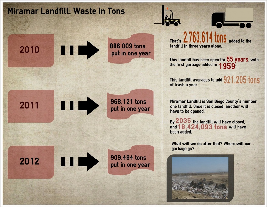
Here is my final infographic. Making it, my group tried to keep in mind the key concepts of an infographic, information shared graphically. There aren't supposed to be many words, so we made one very simple side with just the data, then another with more facts. We also made the important numbers or data points larger, and in color on the fact side. That was to make sure that they were very eye-catching. We also tried to use a darker color palette for the whole thing, for the mood.
